No Sheds, No Sea Bass: Twelve Masculine Card Designs That Skip the Clichés
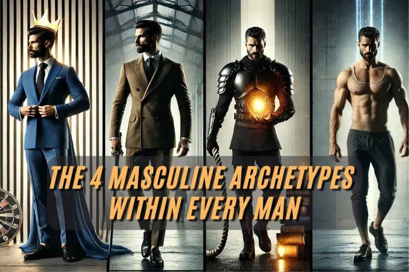
Photo: masculine handmade greeting cards kraft paper monochrome typography flat lay, via masteringyourpath.com
We've all done it. You need a card for a brother, a colleague, a father-in-law, a friend of thirty years — and your hand hovers over the same three stamps: a fish, a car, a pint glass. It's not that these things are bad. It's that they assume a personality. The bloke who reads three novels a month, or who fixes bikes but would rather not be defined by it, or who simply has no hobbies worth stamping, gets the fish by default.
So let's retire the fish. Below are twelve design ideas that lean on colour, type and texture rather than hobbies — plus a few notes on palettes, sentiments and stash-friendly swaps. Think of it as a menu: pick two or three ideas per card and stop before you add a twelfth layer.
Begin with the palette, not the story
Most masculine cards fail at the colour stage. We reach for navy and grey, then panic and add black, and the whole thing looks like a corporate annual report. Try these instead:
- Driftwood neutrals. Kraft, oatmeal, warm grey and a single hit of off-white. Quiet, tactile, flattering to any sentiment.
- Slate and ochre. A cool grey-blue as the base with one warm mustard accent. It's the colour scheme of a good coffee shop, and it works every time.
- Deep teal and sand. Fresher than navy, still calm. Pair with a cream card blank rather than stark white.
- Monochrome plus one. Black ink on white card, then a single element in rust, olive or copper.
A useful rule: if you stripped out every image, would the palette still look intentional? If yes, you've got a card.
Let the type carry the card
A bold word is a whole design. Cut or die-cut a single word — MORE, ENOUGH, CHEERS, TA-DA — and mount it off-centre on a plain panel. Anything from a 60pt alphabet die to a chunky letter die from your stash will do. If you're hand-lettering, use a grid and don't apologise for the wobble; a slightly imperfect word looks handmade rather than printed.
Two typography layouts worth keeping in your notebook:
- The stacked block. Three short words stacked left-aligned, in the same font, varying sizes. HAPPY / BIRTH / DAY. Leave the right-hand third empty.
- The tiny-type joke. One enormous number or initial, then a very small sentiment underneath in capitals with wide letter-spacing. The contrast does the work.
Abstract backgrounds for people who ‘don't like pattern’
Texture reads as masculine far more reliably than motif does. Ink smooshing on a glass mat, a light pass with a brayer through a stencil, brushos spritzed sparingly, or an embossing folder used tone-on-tone on the same colour as the card stock — all of these say ‘considered’ without saying ‘flowers’.
If you want a really low-effort win, emboss a plain panel, drag a pigment ink pad lightly across the raised surface, then trim and layer. Roughly four minutes, and it looks like a stationery shop did it.
Twelve starting points
- The colour-block slant. Cut one panel at an angle and layer over a contrasting card blank. Add a small stamped sentiment in the narrow band.
- The oversized ampersand. One enormous character centred, with the two names in tiny type beneath. Ideal for anniversaries and pairings of any kind.
- The paper-stitch maze. Draw a simple maze of straight lines in fineliner and pierce the ends; thread with embroidery floss. Oddly soothing to make, and never looks like anyone else's card.
- The ticket collage. Layer old bus, gig or train tickets (or printed reproductions), overlapping, with a torn edge. A date in the corner personalises it instantly.
- The gel-plate pull. One good monoprint, trimmed to a slimline panel, plus a strip of vellum and a stamped line of text. Nothing else.
- The tool-box minimal. A single circle punch, a square punch and a triangle, arranged as an abstract composition in three colours.
- The book-spine stack. Strips of coloured card cut to different heights, aligned at the bottom, with a title stamped across them.
- The heat-embossed line drawing. A simple continuous-line stamp (a mug, a chair, a mountain range) in copper or matte gold on dark card. One image, lots of space.
- The weaving panel. Six strips of two coloured papers, woven, trimmed to a square, mounted on kraft.
- The window reveal. A circle or rectangle aperture with a message showing through from the layer beneath. Good for a joke you don't want visible until opened.
- The number card. The age, huge, in an outline font, filled with a stamped pattern or left empty.
- The plain one. Really good card stock, really good envelope, one small stamped sentiment. Underrated. Some people need this card most of all.
The sentiment is where the personalising happens
The quickest way to make a card feel bespoke isn't a die set, it's a sentence. Swap ‘Happy Birthday’ for something only you two would know: ‘Thanks for the lift at 6am, every time’ or ‘Still the best parallel parker in the family.’ Print it on the computer, stamp it, or write it by hand — the medium matters far less than the specificity.
Stash-friendly swaps
| If the idea calls for… | Try instead… |
|---|---|
| Alphabet dies | Printed type from your computer, or a journalling stencil |
| Gel plate | A piece of acetate and a brayer, or a stencil and a sponge |
| Gilding flakes | Gold embossing powder, or a metallic marker |
| Patterned paper | A stamped background in a tonal ink |
| Vellum | Baking parchment (yes, really, for layering only — never near a heat tool) |
One last fold
The men on your list aren't a category, they're people. Build the card around a colour they actually wear, a word they actually say, or a joke you actually share, and the fishing tackle suddenly looks as dated as it is. Save yourself the trip to the craft shop — you almost certainly already own everything you need.