Read Before You Write: The Typography Rules That Make a Handmade Card Look Finished
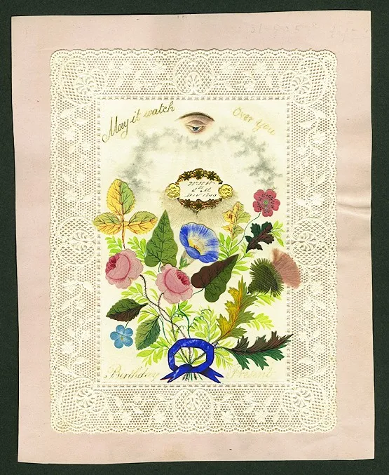
Photo: Unknown, Public domain, via Wikimedia Commons
There is a particular kind of card that turns up at every craft group I've ever sat in on. The papers are beautiful. The die-cutting is immaculate. The colour combination has been agonised over for a fortnight. And then, in the top corner, there is a stamped sentiment so small that you have to lean in to read it, jammed against the edge, slightly crooked, with the words crowded together like the last bus home.
It's a shame, because ninety per cent of that card is lovely. The problem is the ten per cent that carries the message.
This is an opinionated piece. I'll own that. But I think the words on a card front deserve more planning than the paper does, and I think most of us — myself very much included — give them less.
Rule one: one hero phrase, five words maximum
The card front is not a letter. It is not a caption. It is a poster, and a poster gets one idea.
Five words is a generous ceiling, and three is often better. 'Happy Birthday, Janet' is stronger than 'Wishing you a very happy birthday and a wonderful day'. 'Sorry for your loss' will always out-perform anything longer, because brevity is what sincerity sounds like.
If you find yourself shrinking your lettering to make the words fit, the answer is almost never a smaller stamp. The answer is fewer words.
Rule two: give every element a job
A finished-looking front has three roles, and only three.
- Hero: the big thing. One line, high contrast, plenty of space around it.
- Support: the detail — a name, an age, a date. Always smaller than the hero, never competing.
- Whisper: the optional extra. A tiny stamped sprig, a single word in the bottom corner, a small heart. One only.
If a fourth element turns up and you can't assign it a role, it's decoration pretending to be content. Put it back in the drawer.
Rule three: keep a thumb margin
Here's a measurement that has saved me more cards than any ruler. Lay your thumb flat against the edge of the card. The first joint is roughly the minimum margin your sentiment should respect. It looks generous on an A6 blank — and generous is precisely the goal.
Text that runs close to an edge reads as an accident. Text with air around it reads as a decision.
Rule four: two typefaces, and scripts are guests
Pairing fonts is where the confidence goes. Three typefaces on one A6 card will always look like a jumble sale, however nice each one is on its own.
Two is plenty: a strong sans-serif for the hero and a lighter serif for the supporting line, or a clean serif with a plain hand-lettered script if you want warmth. Never pair two scripts; they fight for the same personality. And if you do use a script, use it for one short phrase — a name, or 'congratulations'. Scripts are guests at the table, not residents.
The same logic applies to stamps. A bold sentiment stamp and a fine-line sentiment stamp can live together. Two bold sentiment stamps cannot.
Rule five: contrast, not decoration, makes text legible
A pale grey sentiment on a busy patterned paper is invisible, and no amount of gems will fix it. The fix is contrast: either a clear space on the paper, a plain tag or label behind the words, or a switch to heat embossing.
White embossing powder on a mid-tone background is the single most reliable upgrade in card making. It gives the text a little weight, so it sits on the surface rather than sinking into it.
Pick one axis and stay loyal
Centred or aligned to the left. Not both on the same card. The moment a centred hero sits above a left-aligned name, the eye starts looking for a reason and finds none.
Centring is calm and formal — good for sympathy cards, good for anything with a symmetrical design. Left alignment is more relaxed and more modern, and it plays nicely with a stamped border down one side.
The squint test
Stand up. Step back two metres from the card and squint. Whatever still reads is what your recipient will notice when they pick the card out of its envelope.
If the card front looks like three grey smudges, the hierarchy has failed and no amount of gold foil will rescue it. If the hero phrase still reads clearly and everything else has softened politely into the background, you've got it right.
What to do about handwriting
Handwriting frightens people unnecessarily. Two things help enormously.
First, rule a faint pencil line and erase it afterwards. Obvious, but almost nobody does it, and it is the difference between a name that sits level and one that slides downhill.
Second, practise the exact phrase on a scrap before you commit. Not the alphabet, not a warm-up flourish — the actual words. Your hand learns the shape in about four attempts.
A fine-liner in black or a matching dark ink is more forgiving than a marker, which spreads. And if a name has to be squeezed under a sentiment you've already stamped, don't. Put it on a small tag and layer it.
The three-step formula
If you take nothing else from this piece, take this order of operations.
- Choose the hero. Write it out and cut it to five words. Say it out loud; if it sounds like a greetings-card cliché, it probably is, and shorter will be better.
- Assign the roles. Hero, support, maybe a whisper. Anything else is not invited.
- Space it, then stamp. Pencil the position, use a stamp positioner, measure your thumb margin, and check the squint test before the adhesive comes out.
One last thought
When a sentiment goes slightly crooked — and it will — you have two choices. You can add a frame, a border or a tag to pull the eye away, which is a perfectly good fix. Or you can add a hand-drawn line beside it so the tilt looks deliberate.
What you can't do is fix a card that says too much in too small a space. Start with the words. The paper will follow.