The Window Test: Picking Card Colours That Shine on Grey Afternoons

November in the UK has a particular kind of light. It is not quite dark at 10am, not quite bright at 2pm, and by the time you have found the good scissors, the sun has already clocked off. If you have ever made a card at the kitchen table, loved it, then taken it into another room and wondered why it suddenly looks tired, you have met the winter light problem. The colours have not changed. The light has.
Why a grey day changes everything
Low winter daylight is cooler and weaker than the light we craft in during summer. It flattens contrast, mutes warm tones and gives pale colours a slightly blue-grey cast. Whites can read as dingy, soft pinks can look washed out, and metallics either save the whole design or vanish into the background. North-facing rooms feel this most, but even a bright south-facing window can serve up a surprisingly cool light on a rainy Tuesday.
This is not a reason to reach for neon. It is a reason to test before you commit glue to card. A few minutes of looking at your paper scraps in the same light your card will be seen in can save a whole afternoon of fiddling.
The five-minute window test
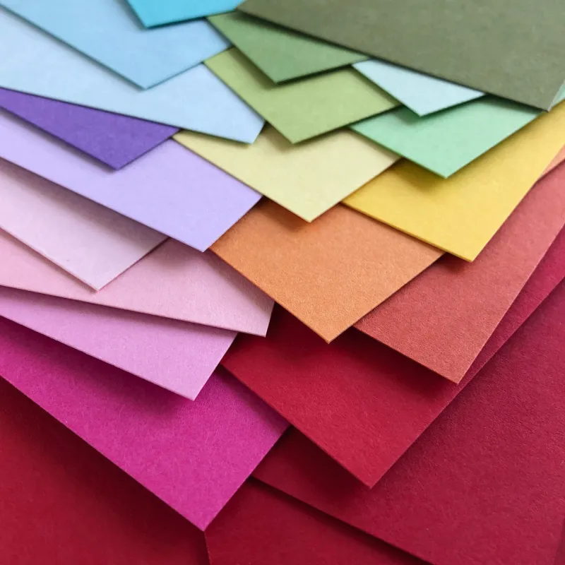
Start with the papers you are actually considering, not the whole stash. Cut small strips or squares, roughly 3cm across, and pair them up as you would on the finished card. Place them on a plain white sheet near a window, but out of direct sun. Look at them from arm's length, then from across the room. Do this twice: once in the morning and once around 3pm, when the light has that end-of-day greyness.
Ask yourself three questions. Does the white look clean or cloudy? Does the contrast between the layers still feel deliberate? And does the metallic or textured element stand out, or is it just making the whole thing look busy? If a combination only works when you hold it six inches from your nose, it is probably not the one.
Before gluing anything, take a quick phone photo. This is not about creating a perfect image yet. It is a reality check. Winter light can make a card look softer and more elegant in real life while your phone turns it into a muddy puddle. If the photo looks murky, simplify the palette or add one stronger contrast point.
Warm neutrals that beat the blue cast
For November and December makes, warm neutrals are your quiet allies. Oatmeal, mushroom, soft sand, warm cream and a gentle terracotta all sit beautifully in low light. Pair them with muted mustard, sage or a soft brick red rather than icy pastels. A warm off-white layer behind a focal image often looks more intentional than bright white, which can turn slightly grey against the window.
For festive cards, try cranberry and forest green with cream and antique gold rather than bright red and silver. The deeper tones hold their richness when the light is poor, and the cream stops the whole design from feeling heavy. If you want a calmer December birthday card, mushroom cardstock with a soft peach die-cut and a fine brown ink sentiment is the sort of combination that looks handmade rather than half-finished.
High-contrast palettes also work hard in winter light. Navy and cream with a touch of copper, black and warm white with a single red accent, or deep green with pale kraft and gold all keep their shape at a distance. The trick is to choose one strong dark, one reliable light and one accent. Too many mid-tones start to blur together when the sky is doing its best impression of a wet flannel.
Metallics, texture and the glare trap
Metallics are tricky on grey days. Bright silver can look cold and disappear against pale paper, while very shiny gold can catch the window and throw a glare that makes the design hard to read. Matte gold, antique brass and warm copper tend to be more forgiving. If you are using glitter or foil, place it next to a matte texture so the eye has somewhere to rest.
Texture is often more reliable than shine. Embossed panels, linen cardstock, vellum layers and dry-embossed backgrounds create shadows that low light can actually pick up. A simple white-on-white embossed card with a warm cream sentiment can look far more luxurious than a design covered in metallic embellishments. Test texture the same way as colour: hold it near the window and see whether the detail survives at normal viewing distance.
Photographing finished cards when the sun clocks off
For reader gallery photos, forget waiting for a sunny day. Use the brightest window you have, turn off overhead lights, and place your card on a plain white or pale grey surface. A piece of white foam board behind the card can bounce a little light back in. Stand the card upright if possible, because laying it flat can create awkward shadows.
Tap your phone screen to focus on the card and gently lower the exposure if the white starts to glare. Avoid zooming; move closer instead. A small amount of editing is fine, but do not push the brightness until the cream turns yellow or the reds start to glow. The aim is a clear, honest photo that shows the layers and texture. If the card looks good in a dull November window, it will look good in the gallery too.
A small grey-day kit
Keep a few useful bits together for winter making: warm white cardstock, black and navy scraps, kraft, a matte gold pen, a texture folder and a plain white photographing board. Add a pencil for labelling swatches with the date and the light conditions. It sounds fussy, but a swatch that worked beautifully on a bright frosty morning may look completely different at 3pm in the rain.
Low light does not have to mean dull cards. It simply asks you to look a little more closely before you stick. Test by the window, choose warm neutrals or strong contrast, let texture do some of the work, and photograph your finished make in the same honest light. Then put the kettle on. The grey afternoon is already doing its best.