Open and Say Something: Designing Card Interiors That Earn Their Keep
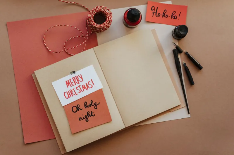
There is a particular moment in card-making when the magic wobbles. You have spent an evening choosing the paper, die-cutting the sentiment and arranging the embellishments just so. The front is a triumph. Then you open the card, pick up a pen and write something like 'Happy Birthday, love from both of us' across a bare expanse of cardstock. Lovely, yes. Finished? Not quite.
The front of a card is the shop window. The inside is the living room. It is where the recipient actually goes, where they linger, where they read your words twice and maybe tuck the card into a handbag to keep. Yet it is often the part we plan least. This is not a call to fill every millimetre with patterned paper and tiny die-cut butterflies. It is a call to give the interior a bit of thought before the pen comes out.
The bit we all skip
Most of us design the front and decorate the inside only if we remember. That is understandable: the front is what gets photographed for the reader gallery. But a handmade card that promises delight on the outside and delivers a blank, slightly buckled inside can feel like a present wrapped in beautiful paper around a supermarket sandwich. The contrast is the problem, not the simplicity.
A clean insert panel with a few faint writing lines can feel far more considered than a chaotic interior stuffed with scraps. The aim is not more stuff. The aim is a card that feels finished before you have written a single word.
Start with the message, not the paper
Before you cut anything, decide what kind of message the card needs. Is it a quick birthday hello, a long newsy letter, a sympathy note where every word matters, or a card that will hold a gift card or bookmark? A few seconds of thinking saves a lot of crossed-out scribbling later.
If you are writing several paragraphs, give yourself a proper panel. If the message is short, leave white space rather than scattering embellishments around the words. And do keep post in mind: an interior that bulges like a packed suitcase will not slide happily into a C6 envelope, especially once Royal Mail has had its way with it. Thoughtful does not have to mean three-dimensional.
Insert panels: the decorator's best friend
An insert is simply a piece of paper fixed inside the card to give you a clean writing surface. It can cover a dark card interior, hide glue marks, stop ink bleeding through to the front, or add a flash of colour without overwhelming the design.
Cut the insert about 5mm smaller than the card on each side. For an A6 card, that means roughly 95 x 138mm. Use a smooth writing paper around 80 to 100gsm rather than the same heavyweight cardstock as the card base; it folds more easily and takes pen far better. Attach it with a strip of tape along the top edge or with photo corners, so the paper has a little room to move. Gluing the whole panel flat is a shortcut to a buckled card.
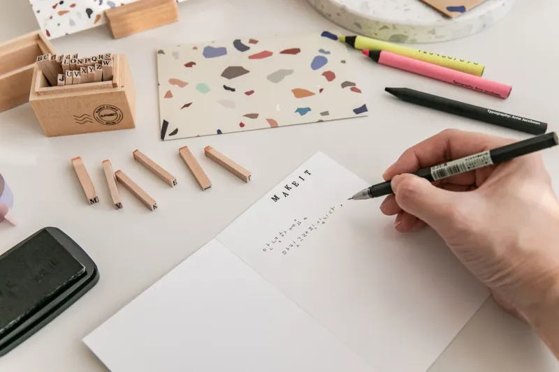
For a dark or heavily patterned card, a pale insert is a small act of kindness to whoever is reading it. Add a stamped corner motif, a strip of washi tape or a tiny label, and suddenly the inside looks intentional rather than improvised.
Lines are not cheating
Some crafters treat writing lines as a confession that they cannot write straight. Nonsense. Faint pencil lines are a practical tool, like a ruler or a bone folder. Draw them lightly, write your message, let the ink dry properly and erase the lines afterwards. Or print a simple insert with pale grey lines and a small heading. It looks smart, guides the eye and takes minutes to prepare.
If you make cards for a charity stall or a monthly card club, printed lined inserts are a quiet lifesaver. They make a batch look cohesive and stop every message from sliding downhill towards the bottom right corner.
Pockets, flaps and little reveals
A hidden pocket is a lovely way to make the inside earn its keep. Tuck in a gift card, a tea bag, a pressed flower, a bookmark or a little handwritten note. Add a semicircular notch so the recipient can pull the surprise out easily, and keep the pocket on the lower half of the panel so it does not fight with the fold.
The same rule applies as with every interior extra: test the fit. If the card will not close neatly or slide into its envelope without a fight, trim the pocket or move it. Delightful details should not turn posting into a wrestling match.
Leave room for the pen
Handwriting needs a runway. Leave generous margins, avoid placing raised embellishments where a right hand will rest, and think about which panel the recipient will naturally read first when the card opens. A small 'To' and 'From' at the top, a stamped motif in the corner and a clear space for the message will always look more polished than a beautiful border that leaves nowhere to write.
If the card is for someone who keeps cards, add the date in small pencil on the back of the insert. It is a tiny detail that future readers will thank you for.
A five-minute interior upgrade
Try this on your next card. Cut a pale insert, draw three or four faint pencil lines, attach it with two small pieces of tape at the top, add a stamped corner and write your message. That is it. No new tools, no expensive kit, no elaborate fold. The card will feel calmer, more personal and far more finished.
The finished-card test
Before you seal the envelope, open the card as if you were the recipient. Is there room to read? Does the insert sit flat? Does the card close without a bulge? Would you be pleased to receive it? If the answer is yes, the inside has done its job. The front may be what catches the eye, but the inside is what gets kept. Give it a little of the same care, and your handmade cards will feel properly complete.